Create a Branded Form in Five Simple Steps
In this article:
The importance of branding
Maintaining a consistent brand is essential for any campaign or organization. A well-established brand evokes familiarity and should allow viewers to recognize your content, name, and mission.
Specifically, branding is also a logo, colors, fonts, and sometimes a slogan. These elements should be used consistently and as frequently as possible so your audience can recognize your content.
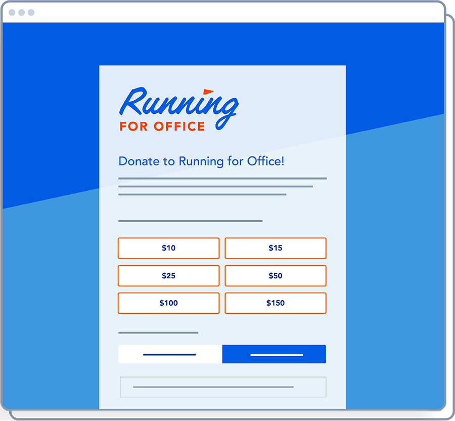
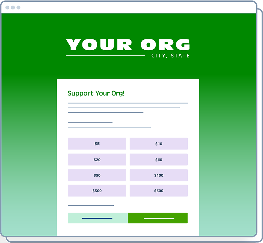
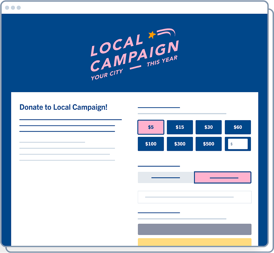
ActBlue has customizable settings to create forms to fit your brand. By following these simple steps and guidelines, you can build a branded form and save time by focusing on the form elements that stand out to supporters. The three example forms at the top of this article were designed by changing only four settings in the form editor.
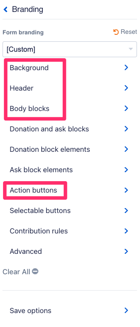
While there are many settings available for you to adjust and experiment with, you can implement your brand by editing the Background, Header, Body Blocks, and Action Buttons within the “Branding” section of your form editor.
1. Background
Changing the background of your form is an easy way to incorporate your branding and make your form more than a plain white page.
You can change your background color to match your specific colors. Simply paste in the hex code for that color. A hex code is a 6-symbol code used to digitally represent a color.
Changing the background of your form is an easy way to incorporate your branding and make your form more than a plain white page.

Alternatively, you can upload a background image. Note that your form will hide parts of your image. Your form will likely cut off a picture with a subject centered in the middle of the page. We recommend uploading an image that fits your brand but isn’t too busy and distracting.
Consider what your form looks like on a mobile device. You may want to disable your background image on mobile to avoid a cropped picture. You can do this with a single click in your form settings!
2. Header
Your group’s logo should go on the header of your form. You can adjust the size and alignment of your logo. Be careful not to make your logo so big that it detracts from your form.
3. Body Blocks
Your form lives within the body blocks. You can change the arrangement of your body blocks to be either Stacked (narrow) or Side-by-side (wide). Like the background, you can also change the color of the body blocks. The most important thing is to ensure strong contrast between the text within your body blocks and the background behind that text. Contrast increases the accessibility and readability of your form.
4. Action Buttons
By editing the Action Buttons tab of your branding, you can easily make the buttons on your form match your branding by changing the color of your Action buttons. Simply paste in the hex code.
5. Social Share
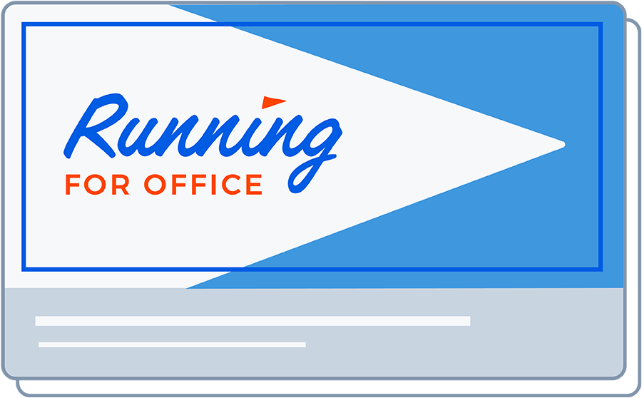
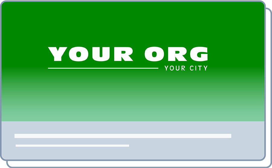
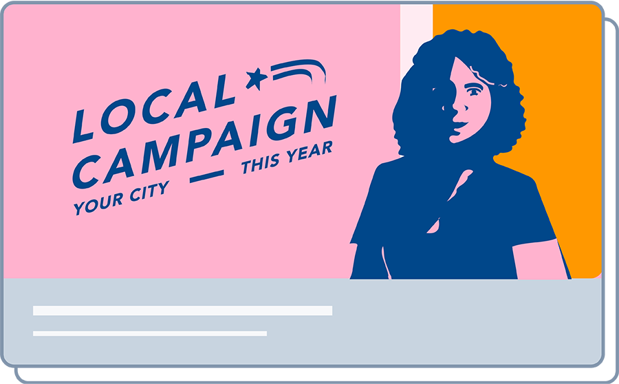
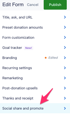
From the main form editor (not under “Branding”), select “Social Share and Promote.”
Your social share is what your form looks like when the link gets shared on social media. A lot of fundraising happens on social media, so your social share should always match your brand. Upload social share images so that your form looks sharp and appropriately branded when it gets shared.
In this section, you can also edit the text showing when someone shares your form. Learn more about social share in this article.
Pro-Tips
Create a default branding you love
ActBlue allows you to save your brandings for reuse. We recommend having at least one saved branding that is versatile, evergreen, and fits the look and feel of your campaign or organization. Spend time creating a reusable branding that you can easily apply to future forms. Read more about detailed branding settings here.
Reach out!
Our digital fundraising experts are available to help you and can even make customized forms for you! Contact your ActBlue representative or find out who your representative is by emailing support@actblue.com.
